

A great Lens-Artist Challenge this week chosen by Patti at P.Moed. I don’t convert as many colour images to BW as I should. Probably because I’m predominantly shooting stock images. Most of these stock images are bought for newspapers, magazines and books. I’ve always thought that any buyer would probably employ people, much more adept than me, at manipulating images. Should they want a BW version of my image, with the original image in colour, they have both options.
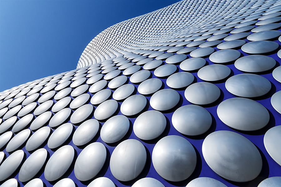
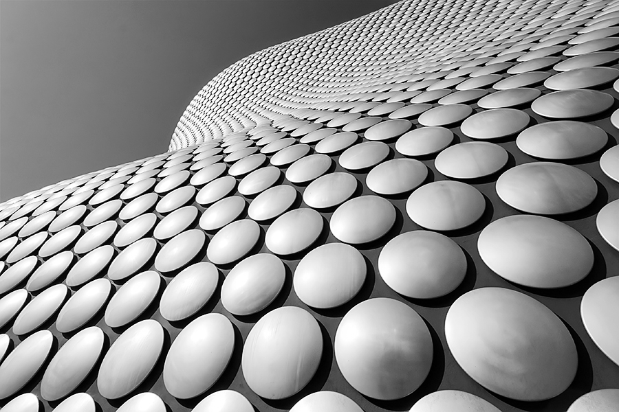
One reason for blogging regularly is to get out of my stock image mindset so this challenge was a nice reminder that there’s a whole world of BW photography for me to explore. Here’s a few conversions I made in Photoshop for this weeks challenge.

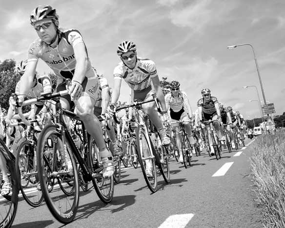
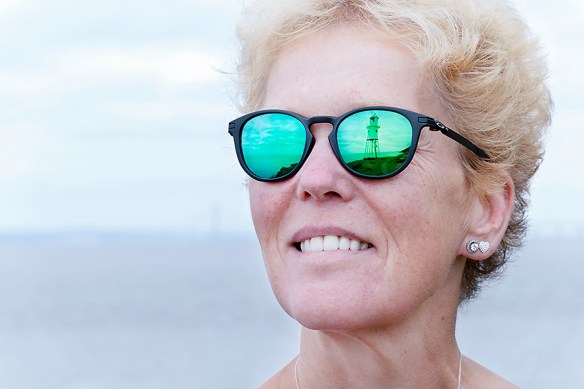
I’m also partial to spot colouring or colour backing images from time to time. It’s a dated process but sometimes it just works really well. Combining colour and BW into one image. I sometimes use a partial version of the technique, desaturating backgrounds to make a main bold colour, in the foreground, stand out even more. The image below started out that way but I also really liked the result pushing it the whole way. Just a bit of fun in photoshop or with the excellent ‘Color Pop’ App on my ipad
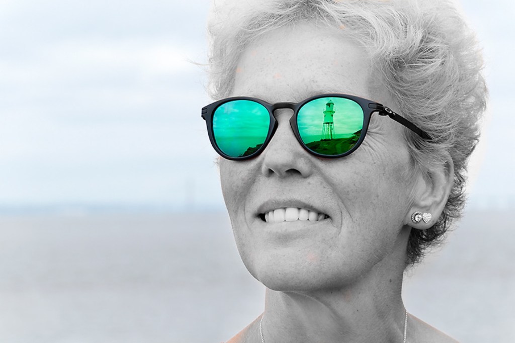
I hope you enjoy the images, thanks again to Patti for hosting the challenge.
All images: ©Stephen Hyde 2007-2025 – All rights reserved.

Very well done Steve. Loved your subjects for the week. I loved the first image and think it works really well either way. The third is very clever and I loved the spot coloring effect.
Thank you Tina, that’s much appreciated. The third image is one of my favourites and I took that a long time ago. I like the way the cyclists are all looking at me. They’re probably thinking I’m mad being that close to the road, although I was on the grass verge and not in their way. 🙂
The Selfridges building is wonderful either way, all the other images I tend to prefer the coloured ones. Great collection!
Thank you Sofia. I prefer the colour images myself 🙂
The architectural ones I find really interesting. Looks almost like they were taken at different times of the day. Great images.
Thank you Leanne. Having read your post for this challenge I might take up a BW challenge to try and hone my skills. It’s a skill I need to improve
We do a challenge every Wednesday on my blog, so please feel free to join in. We do a theme every second week, and then the other week to post whatever you want.
Thank you Leanne. I’ll look out for the challenge this week 🙂
Wow! I guess I have a simple answer: I love all images in monochrome. The labradoodle, especially, begs for us to examine the details and texture and not worry about its color.
Thank you Egidio. You certainly have to think a bit more about your textures and colour matching in BW. I tried some woodland shots and for me the browns and greens were to similar in once converted. It ties in quite well with another recent challenge for opposites on the colour wheel. perhaps those images work better
Great photos all the way around. I especially like the cyclist race. It’s great in color but very journalistic in black and white. I like the portrait with the bold color on a hint of color. And, oh, the dog is great either way. Such a regal pose!