This week our Lens Artists Challenge host is Egidio.
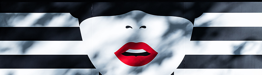
“Complementary colours are those that sit opposite each other on a colour wheel.”

I enrolled in an Open University Photography course back in 2005. One of our course weekly assignments was capturing images featuring colours on opposite sides of the colour wheel. The assignment was part of a tutorial week on using colour in your images and to show what a powerful tool this was. It was my favourite project from all those we were assigned.
You can see it used in lots of commercial photography and branding images. One submission of mine for the Open Uni course was a simple overhead shot of a cup of tomato soup on a blue background. That worked well and I still use complementary colours in my food photography images today.


Thank you to Egidio for hosting this weeks challenge. Please see this page to learn more about the Lens-Artists Challenge and its history.

All images: ©Stephen Hyde 2007-2025 – All rights reserved.

Great examples!!!
Thank you Ana 🙂
I love it – great shots!! Cheers!
The last photo in Morocco is so vibrantly gorgeous!
Steve, my comment is very late. Somehow, WordPress never sent me a ping or listed your post under the hashtag lens-artists (the hyphen is crucial for us to find related posts). I liked the complementary colors in your post. Great opening image as well as the food photos, too. It is, however, with the final image that you pulled all the stops. Excellent!
Thank you Egidio 🙂